Quantile trends in time series data
To understand the trend in time series data, we use quantile regression to determine trends. The advantage of this approach is its flexibility in modeling data with conditional functions that may have systematic differences in dispersion, tail behavior, and other covariate features. In adopting this approach, we reduce the d-dimensional nonparameteric regression problems to a series of additive univariate problems. Next, individual quantile curves are then pecified as a linear b-splines. Once the knot positions of the spline have been selected, such models are then linear in parameters and therefore can be estimated.
Empirical Cumulative Distribution Functions
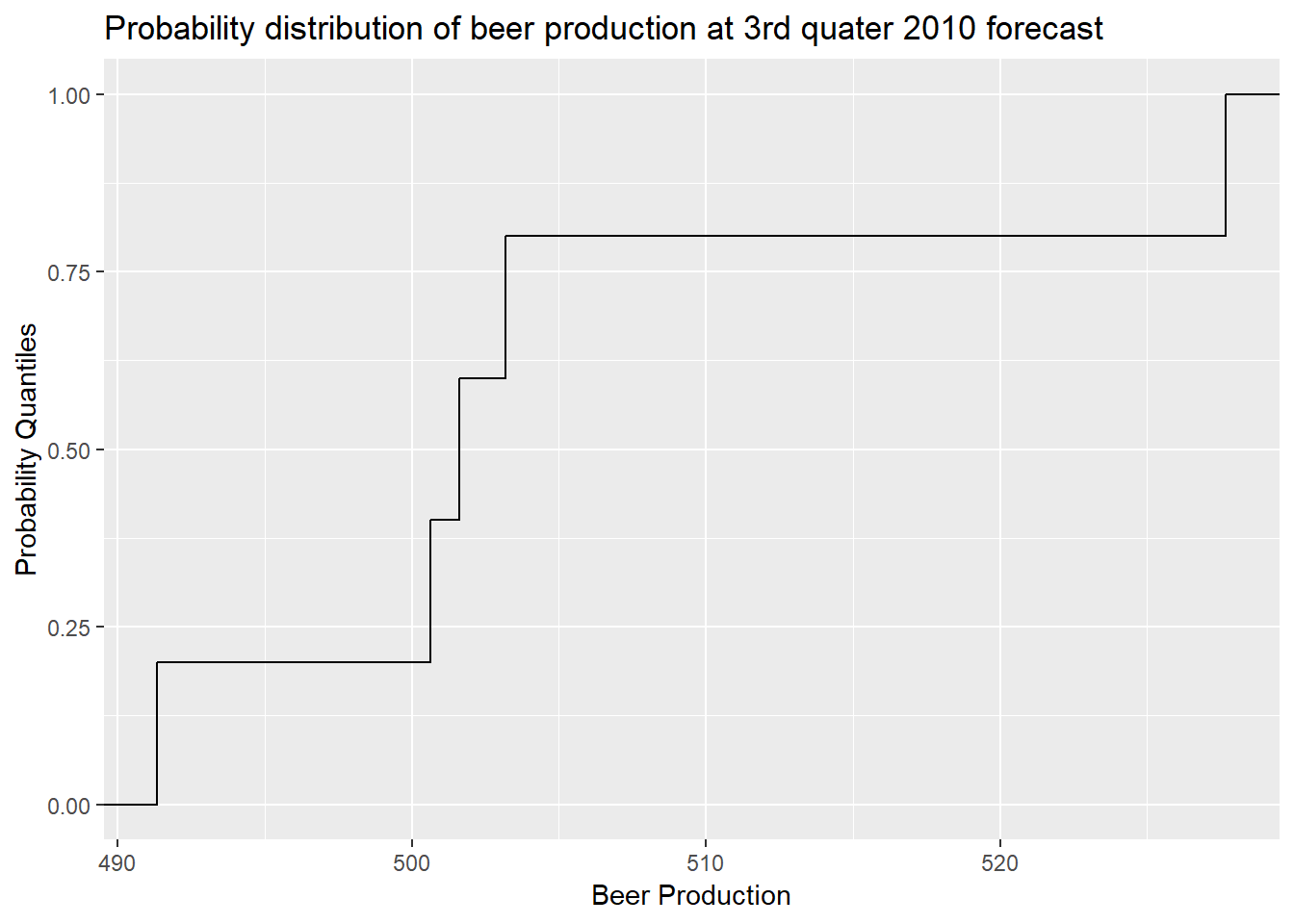
The use of quantile regression facilitates quantization of the prediction uncertainty by constructing empirical cumulative distribution functions (ECDF) at any year of a forecast. The empirical cumulative distribution function (ECDF) is determined by modeling the collection of quantile forecast results.
The data
The data I’ll be using for this blog post Total quarterly beer production in Australia (in megalitres) from 1956:Q1 to 2010:Q2. Data is only used to show case how to apply the functions I’ll be building and the limitations of current methodology to explain uncertainty.
Code part 1 - Packages and data
suppressPackageStartupMessages(library(forecast))
suppressPackageStartupMessages(library(fpp2))
suppressPackageStartupMessages(library(tidyverse))
suppressPackageStartupMessages(library(splines))
suppressPackageStartupMessages(library(quantreg))
suppressPackageStartupMessages(library(RColorBrewer))
We will create a split data for training and testing the data
We are leaving out two years for testing
beer <- window(ausbeer,start=1992,end=c(2007,4))Forecast Parameter setting
step_h = 8Fitting a simple Holt-Winters Model
See `?hw’ for more help
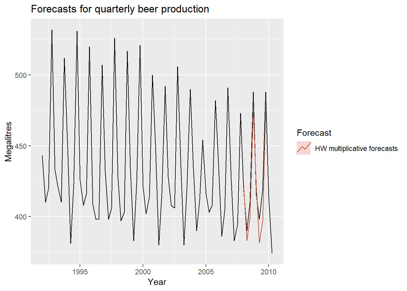
fit <- hw(beer,seasonal="multiplicative")Looking at the data and its forecast
autoplot(window(ausbeer, start=1992)) +
    autolayer(fit, series="HW multiplicative forecasts", PI=FALSE) +
    xlab("Year") + ylab("Megalitres") +
    ggtitle("Forecasts for quarterly beer production") +
    guides(colour=guide_legend(title="Forecast"))
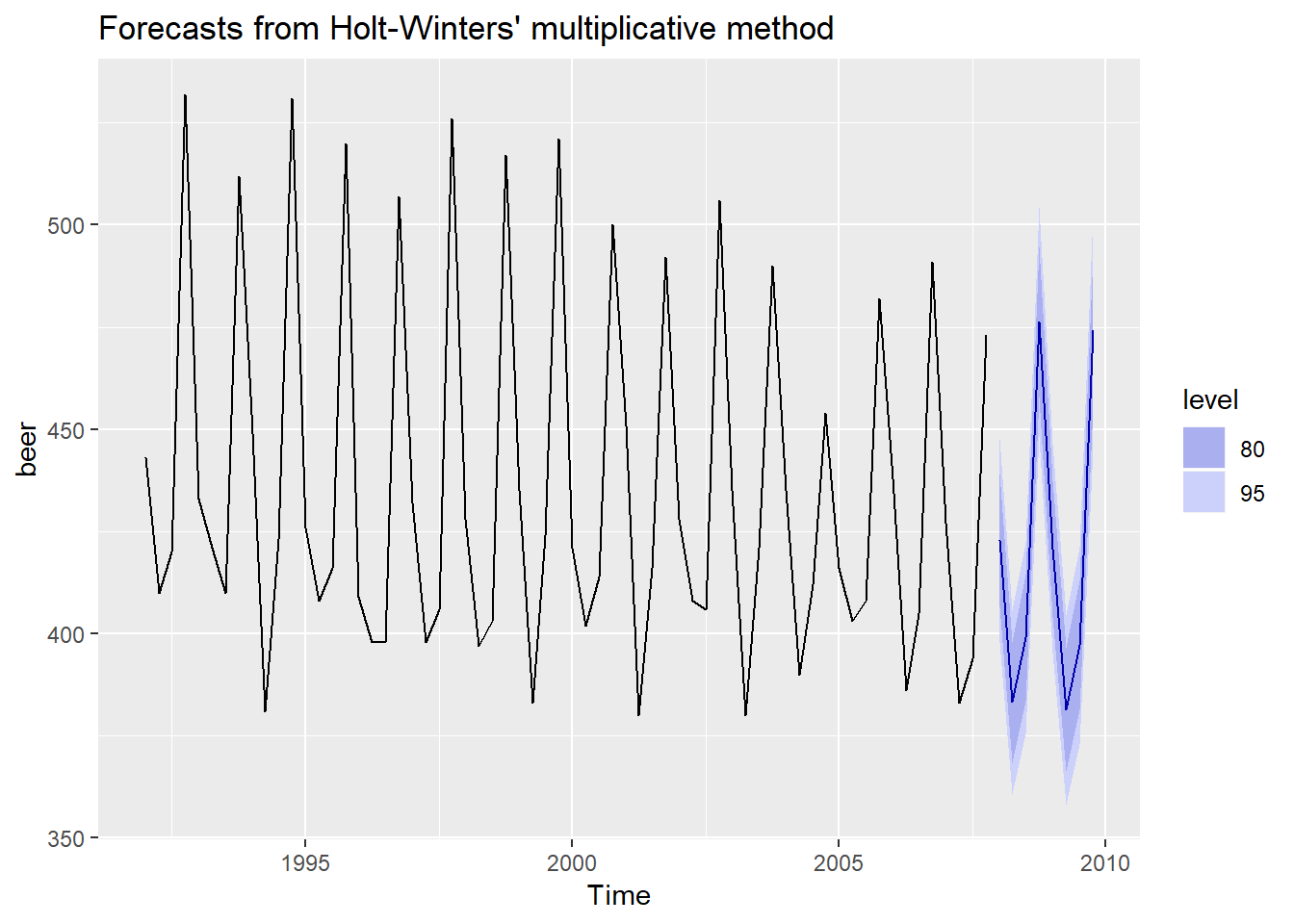
Forecasting the model
fit_frcst <- fit %>% forecast(h=8)

autoplot(fit_frcst)
Measuring the accuracy in the traditional sense
beer_future <- window(ausbeer, start=2008)
accuracy(fit, beer_future)
##                      ME     RMSE       MAE        MPE     MAPE      MASE
## Training set -0.5228136 12.24711  9.294418 -0.1409847 2.149997 0.6499593
## Test set      9.1624415 12.71675 11.308159  2.1263484 2.641392 0.7907803
##                     ACF1 Theil's U
## Training set -0.20924378        NA
## Test set      0.05629771  0.281231
Before we create uncertainty model, we need some pre-processing
some color managment for custom colors
rhg_cols <- c("#771C19","#AA3929","#E25033","#F27314","#F8A31B",
              "#E2C59F","#B6C5CC","#8E9CA3","#556670","#000000")
fixing the data structure
beer_df <- data.frame(Y=as.matrix(ausbeer), date=time(ausbeer))Now, lets look at the uncertainty of the model and data
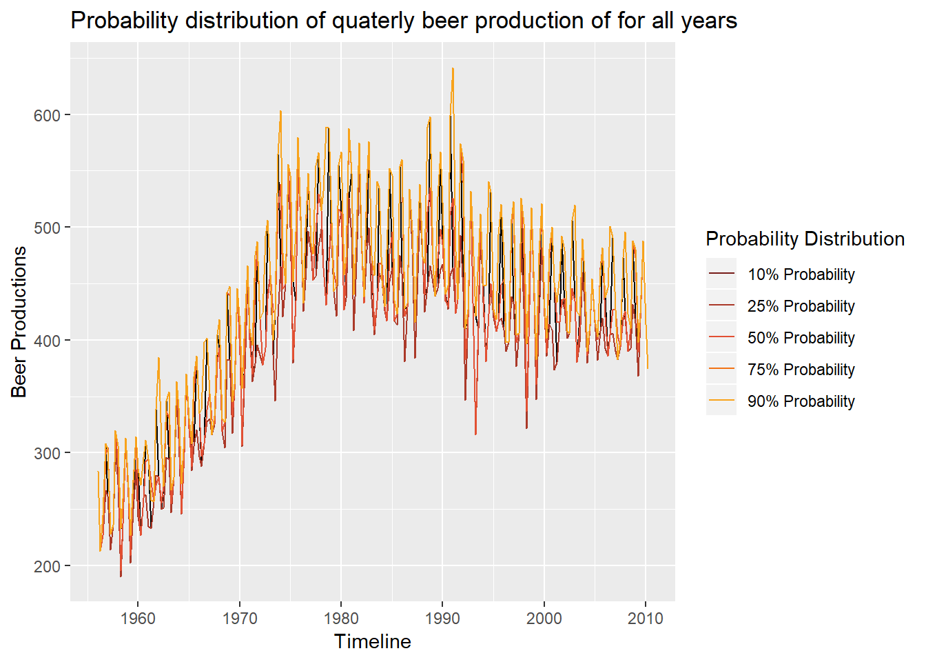
# First, we create a qunatile regression model
#  the knot degree and degrees of freedom have to found for each data
qst <-rq(beer_df$Y ~ bs(beer_df$date, degree = 3, df=120),
         tau = c(0.1, 0.25,0.5,0.75,0.9))

# Plotting the distribution the quantiles and the original data
suppressMessages(ggplot() +
        geom_line(aes(y = beer_df$Y, x = beer_df$date)) +
        geom_line(aes(y = predict(qst)[,1], x = beer_df$date, color = "a")) +
        geom_line(aes(y = predict(qst)[,2], x = beer_df$date, color = "b")) +
        geom_line(aes(y = predict(qst)[,3], x = beer_df$date, color = "c")) +
        geom_line(aes(y = predict(qst)[,4], x = beer_df$date, color = "d")) +
        geom_line(aes(y = predict(qst)[,5], x = beer_df$date, color = "e")) +
        scale_color_manual(name = "Probability Distribution",
                            values = c("a"=rhg_cols[1],
                                       "b"=rhg_cols[2],
                                       "c"=rhg_cols[3],
                                       "d"=rhg_cols[4],
                                       "e"=rhg_cols[5]),
                            labels = c("10% Probability",
                                       "25% Probability",
                                       "50% Probability",
                                       "75% Probability",
                                       "90% Probability")) +
        xlab("Timeline") +
        ylab("Beer Productions") +
        ggtitle(paste("Probability distribution of quaterly beer production of for all years")))
Now lets fully model future data
# Creating a function that forecasts each quantile of our regression line
qoh <- function(qst) {
        qohn <- c()
        for(i in 1:5){
                qohn[[i]] <- predict(qst)[,(i)] %>%
                        nnetar() %>%
                        forecast(h=step_h)
        }

        return(qohn)
}

# Running the function on our regression fit
qoh_out <- qoh(qst)

# Combining the data into a single data frame
results_together <- do.call(rbind,
                            lapply(names(qoh_out),
                                   function(x){
                                     transform(
                                       as.data.frame(qoh_out[[x]]),
                                       Name = x)
}))

# Creating our Y axis based on the quantiles selected in the model
y = c(.1,.25,.5,.75,.9)

# Selecting the time point we like to visualize
x = t(as.data.frame(qoh_out)[1,])

# putting the two points together in a single data frame
df = data.frame(y, x)
names(df) <- c("scale", "unc_window")

# plotting the uncertainty window of the selected time point by putting the data inside an Empirical Cumulative Distribution Function (ecdf)
ggplot(df, aes(unc_window)) +
  stat_ecdf(geom = "step") +
        xlab("Beer Production") +
        ylab("Probability Quantiles") +
        ggtitle(paste("Probability distribution of beer production at 3rd quater 2010 forecast"))
# Storing the data for actual reporting
ecdf_fun <- ecdf(df$unc_window)
ecdf_dat <- data.frame("prob" = ecdf_fun(df$unc_window),
                          "data_dist" = df$unc_window)
What is it good for
You may ask yourself how this is helpful? Most of you encouter time series analysis where you are asked to predict something you think is simple, say the price of real estate. But is a simple output good enough? Outside of Kaggle competitions, the answer is no. In real life, you need a lot more and until now, that answer had been a simple confidence interval which comes with all forecast methods for 80% and 95% intervals. But now, we can actually give the probability bound of each time point along the forecast, which allows for much more accurate prediction interval.